
1. Authentic Korean Style, British Hamburguesa
I’m not sure where to start when it comes to describing my big disappointment in admitting my roots, my national characteristics, and my culture are actually established on various influx of foreign origins. Despite how blatant it sounds, I’m sure that a lot of international students would have felt this disappointment to some extent. As someone who has lived in many countries but spent most of my life in Korea, a homogenous country that still refers to everyone in the world as “foreigners”, this disappointment perplexes me.
It might sound self-contradicting but I have never deeply thought about my roots and was barely self-aware about my nationality until now. It is a clichéd story but usually, people like me end up thinking about this when they are living abroad, or when they are in an environment where they are constantly questioned about what their root is. However, if you are a creator who can’t escape from the fact that your artistic identity, including your cultural background attributes to interpreting your creations, this is an issue that you should confront and clarify for your own sake.
From time to time when I reveal my artwork, here in London, I receive feedback that something about my art is “oriental” or “Chinese-like or Japanese” but this knee-jerk reaction probably came from a visual judgment that was derived from vague visual memories they have accumulated. This is in some ways similar to how AI image generators produce an image. If I feed the AI generator the sentence “Korean still life painting” and “Japanese still life painting” the difference is not going to be significant. Because AI programs collect images from all over the place, and we should be aware that “data” is created by us. Thus being biased and full of prejudice but simultaneously democratized. The collected data is not going to fit into what you have envisioned because the data we the “real human beings” produce is going to be subjective and the program is going to go through all those subjectively posted images on the internet to achieve some kind of objectivity.
To elaborate Korean’s perception of a “Korean still life painting” can vary from a traditional royal painting that was drawn on silk and is kept in national museums, to a westernized Wayne Theibaud- styled oil painting hung up in a contemporary art gallery. As for the Japanese, if you ask them to think about a Japanese still life the answer you will receive is going to have a wide range as well. Usually, the AI generator will gather all the range of possibilities and try to narrow down the average, and that is why you get a vaguely oriental image even though you used distinctive keywords: “Korean still life painting” and “Japanese still life painting”. The reason why I suddenly jumped into talking about AI-generated images is that the emotion that I feel when someone says that my art is “Chinese” is quite similar to the feeling that I get when I see the result of the AI-generated image. It is slightly accurate, but not at all in reality.
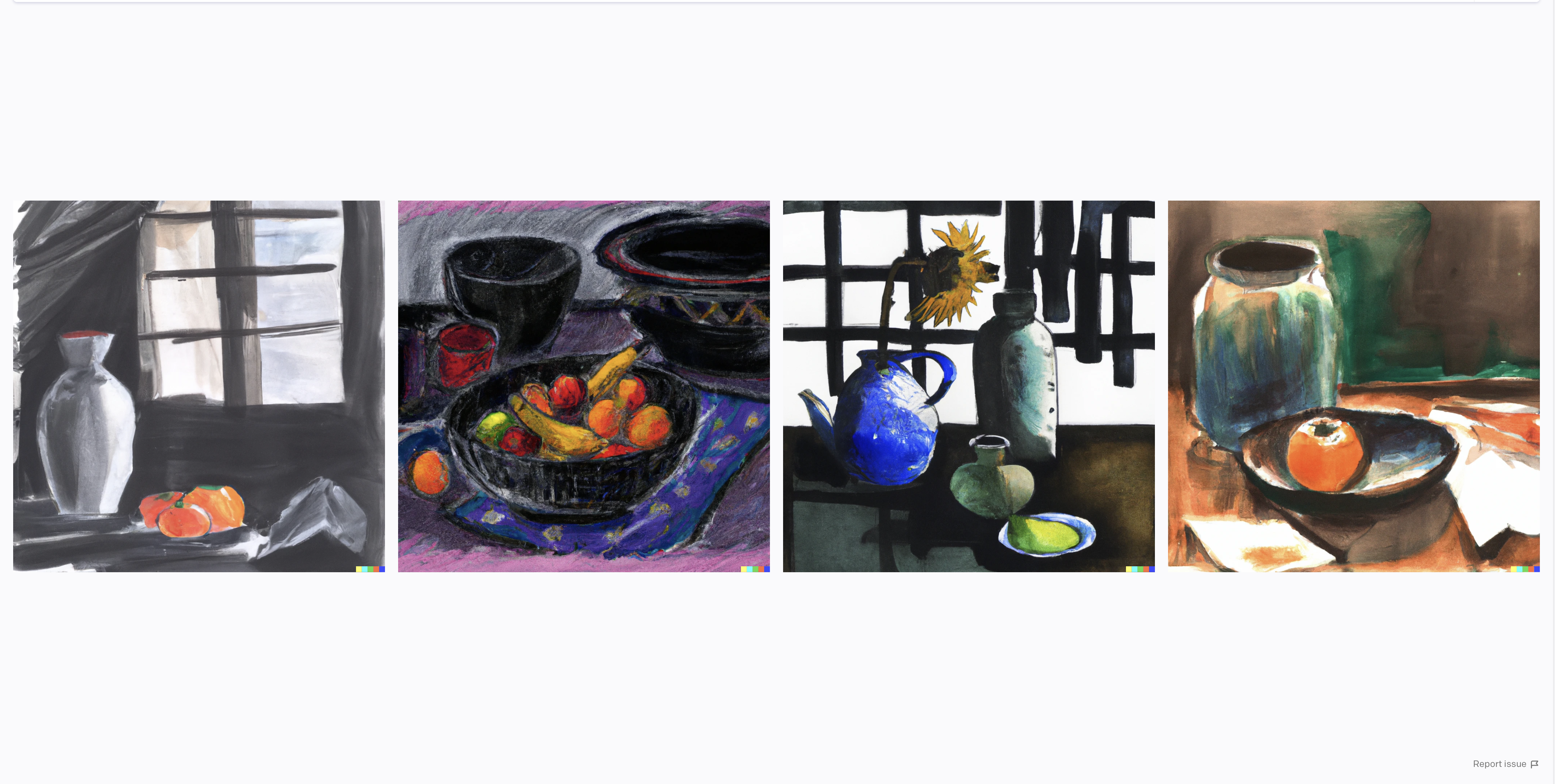
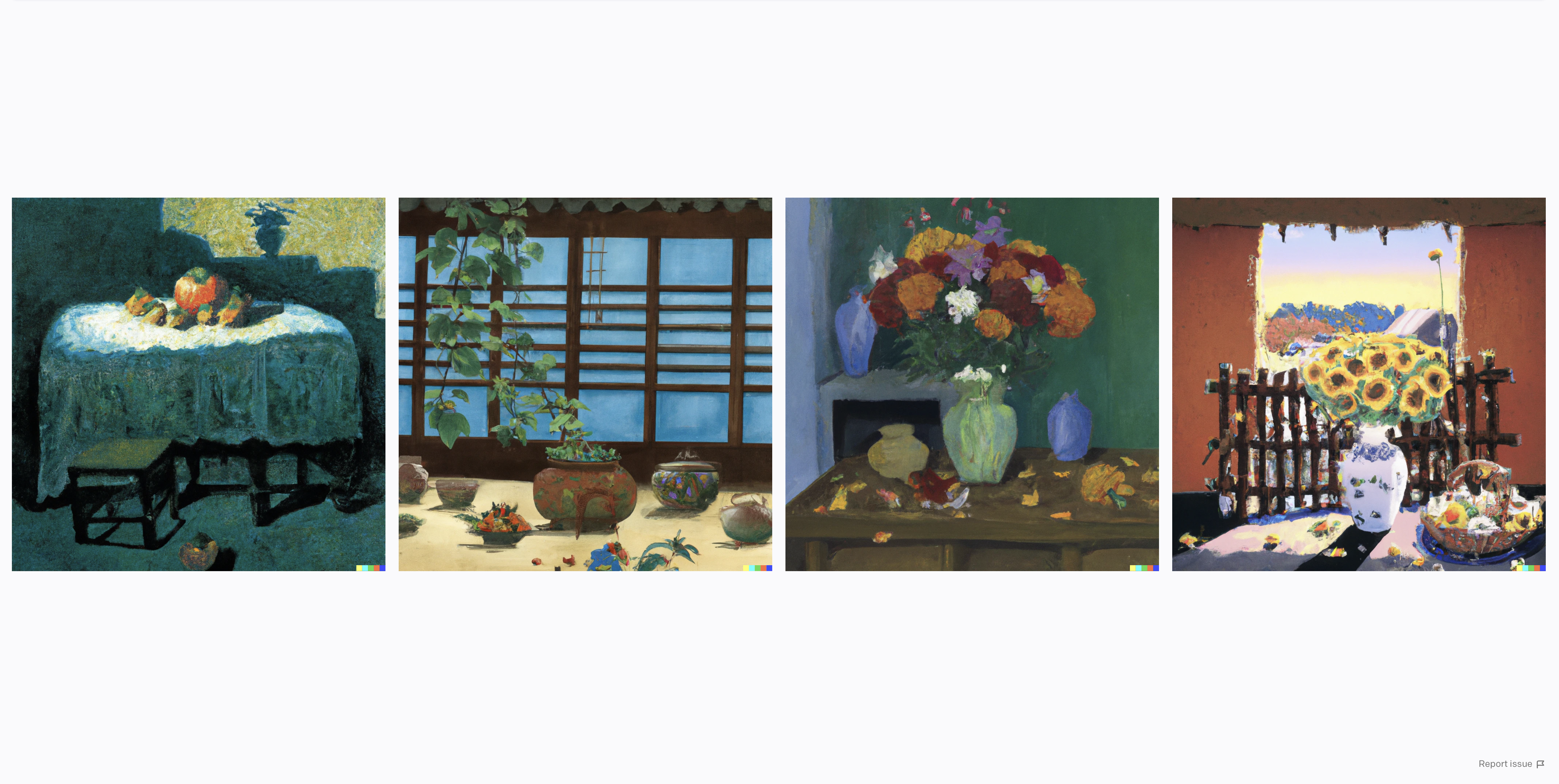
Can you tell which is which?
Highlight the sentence below and you’ll see the answer.
1st: Japanese still life painting
2nd: Korean still life painting,
images created by DALL-E 2
I don’t blame anyone for giving me that feedback, because I think their reaction has a point. I actually am confused when it comes to describing what being Korean is. As I was growing up, I was a bratty teenager who listened to Blur and The Smiths admiring every inch of Hockney’s “The Blue Guitar” series, watching 2001: A Space Odyssey, thinking I was one of the most sophisticated 18-year-olds in Korea (I know it’s hard to bare, but keep that in mind that I was born in 1996, Seoul and YouTube and Facebook was just starting to gain its popularity). As someone who has been he’s only influenced by American and European art, more so than Korean art, it was a bit shocking to hear that some aspects of my art were nevertheless “oriental”. This inspired me to research traditional Korean art, which debunked the fact that Korean art was untouched by influences by other cultures.
This writing continues below.
2. Cabinet of Curiosities
In the last decade the exclusive cultures that did not have legs to travel further, have obtained legs through the rapid flux of technology and have appropriated and assimilated one another. I have no intention to criticize this phenomenon but I was rather interested in how people started to invent the concept of “foreign” and “ethnic” by emphasizing favorable sections of a certain culture. In this writing I am introducing a genre painting “Cheakgeori” and how it is used as a token to show the uniqueness of Korean art.
“Cheakgeori” is a traditional Korean still life painting that emerged in the late Joseon Dynasty (1392-1910), which is around the 18th century. Don’t get me wrong, I think the “Cheakgeori” paintings are not getting the appreciation they deserves. I’m wary of how Koreans promote these paintings as a original style of painting in art history (including Western art) and copying only the external features without looking into their actual origin.
The practice of collecting valuables including precious oil, liquor, gems, precious minerals, scientific instruments, historical artifices, paintings, and sculptures can be found in many places in Europe. However, the famous Baroque and Mannerist style collections, which from now on will be referred to as “Cabinets of Curiosities” (Kunstkammer or also known as “cabinets of wonder” Wunderkammer: German) have originated from Italy’s Studiolo.

Francesco di Giorgio,
Detail of the Studiolo from the Ducal Palace in Gubbio,Italy, 1478–82,
Walnut, beech, rosewood, oak, and fruitwoods in walnut base; 485 x 518 x 384 cm
One of the most famous pieces of Studiolo which can be translated as “little study” is from the Ducal Palace of Gubbio. It was established in the late 15th century, in Italy, Florence. The Studioli (plural) pieces consist of decorative woodwork and paintings. Back then around the Renaissance, the main theme of Studioli was the iconography of four natural elements (air, fire, earth, and water) which involved the feat of scientists, craftsmen, and artists. It served its role as a decorative illustration but also gave a thematic narrative that brings the whole room in unison. The reason for assembling collections from the different fields was to create an encyclopedic archive, thus making a universal museum/ or theater.
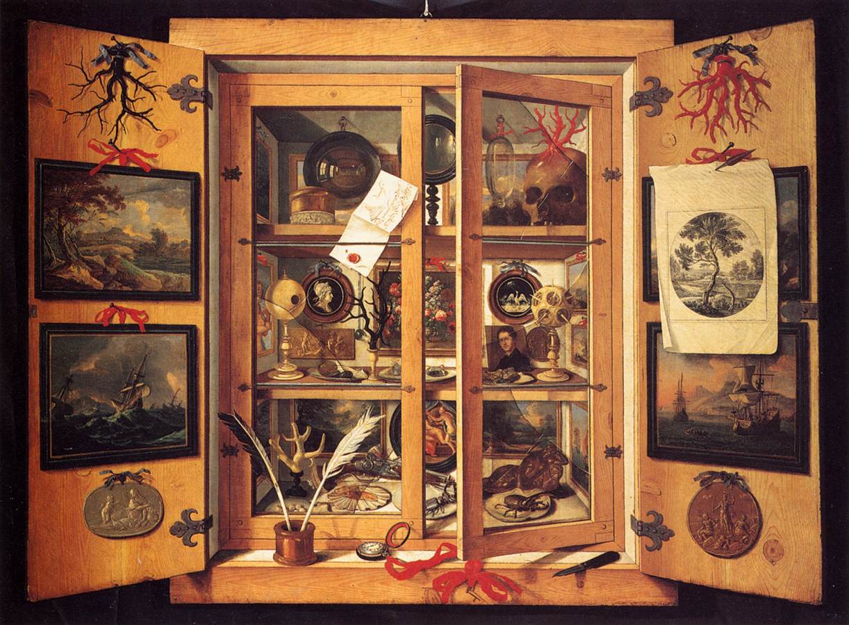
Presumably by Domenico Remps,
Cabinets of Curiosities, 1690s
The interesting part is that people made pictorial depictions of these cabinets. There are numerous Trompe-l’oeil paintings of the cabinets of curiosities, but there is one painting that I would like to focus. A painting from 17th century Beijing, China perfectly exemplifying the fusion of Western Cabinets paintings and Chinese court paintings. Originally from Milan, Italy Giuseppe Castiglione (Lang Shining in Chinese, 1688-1766) was an Italian Jesuit missionary and a painter that served as a Qing emperor's court artist. “Painting of Duobaoge” known to be attributed to Castiglione has been believed by some academics to be the origin of Korean “Cheakgeori” paintings. As a painter trained in the field of Quadratura, Castiglione had to adjust his artistic knowledge of the perspectival method that uses single or more vanishing points to represent the spacial depth. In his painting “One Hundred Horses in a Landscape” he uses three separated vanishing points to distribute the attention of the viewer widely.

Giuseppe Castiglione, Painting of Duobaoge,
China, 17th century. Ink and color on paper, 124.5 x 244.6 cm

Giuseppe Castiglione, One Hundred Horses in a Landscape,
1728, ink and colors on silk, 94.5cm x 7.76m
Korean Cheakgeori paintings bear a big resemblance to the Duobaogo painting by Castiglione. The difference is that the Korean painters have transcribed the real life-like three-dimensional painting, into a somewhat flat picture due to their Confucian values. Another contrast is the notable presence of books. The affinity of Koreans toward books is mainly derived from the cultural values of Koreans regarding knowledge as power. The more knowledgeable they are the more powerful they were and naturally, as books were the means to acquire more information, books were deemed valuable.
It is crucial to take a look at where these foldable screen paintings were positioned. Chaekgeori paintings are known to be typically placed behind the owner’s seat like a backdrop, which is quite similar to the foldage screen painting “Sun,Moon and the Five Peaks” that was traditionally placed behind the King’s throne. This painting, a representation of the King himself, is known to be incomplete without the King’s presence. In other words, the“one moon five peaks” is a mural that tacitly considers the King positioned inside the screen. If this is hard to imagine, try to think of the preset background image in Zoom or other video chat platforms. Chaekgeori paintings behind the owner have supplied the external information of how one wanted to be seen, thus in a sense it is a completed scene with the owner in their presence. Another interesting fact is that the paintings remained open for the visitors to contemplate, even when the owner was not around.

Detail of Chaekgado Panel, Korea, late 19th century.
Ten-panel screen, ink, and color on silk, 161.7 39.5 cm (each panel).
Image provided by National Palace Museum of Korea, Seoul
King Jeongjo (1752-1800 Hanseong, Joseon currently South Korea) of the Joseon dynasty, who was known for his deep admiration for books made a royal library called “Gyujanggak” and recruited painters who were able to draw book cabinet paintings under his guidance. To King Jeongjo, Chaekgeori painting was a vicarious substitute for reading and studying. In addition, Chaekgeori was able to show his empowerment as a monarch, by depicting up-to-date literature inside the painting.
After King Jeongjo’s reign, 18th to 19th century Joseon went through a major upheaval, caused by the influx of Chinese books and opulent objects. Moreover, the social status that was under the influence of strict Confucian discipline gradually changed, with the emergence of a new class called “Jungin” and also by the oppressed literati elites who distanced themselves from Confucian values.
The thesis “Chaekgeori: Multi-Dimensional Messages in Late Joseon Korea” written by Professor Sunglim Kim, gives a detailed picture of the conflict between the emerging upper-class “Jungin” and the pre-existing elite “Yangban”. Despite how wealthy and educated, the Jungin were never able to get the same social status quo as the Yangban, and eventually made them pursue tangible goods, including art objects. At this stage, unlike the King Jeongjo era, Chaekgeori appeared in both Yangban and Jungin’s households as a decorative painting. The styles of Chaekgeori ranged from humble Confucian-influenced paintings to materialistic paintings that depicted valuables. These late Josoen Chaekgeori included meticulously curated symbolic objects that became subjects as a tradition of “painting reading”. This was derived from the East Asian culture that interprets messages conveyed by visual symbolism. Furthermore, this meant the Chaekgeori paintings were able to embed coded meaning hence representing one’s identity.
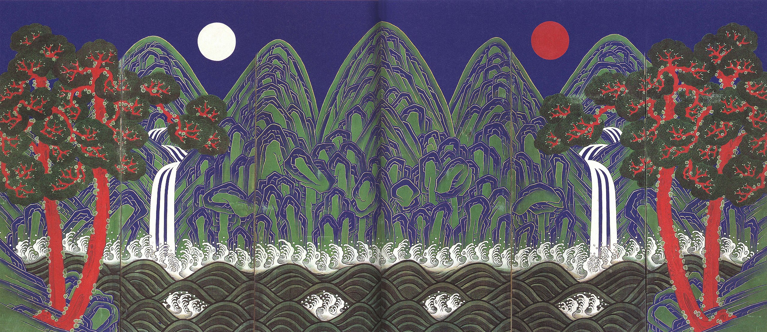
“Sun, Moon and the Five Peaks” (“Irwolgonryundo")
As time passed Chaekgeori was no longer a monopolized style of the court painters. It had become more accessible to other classes generating variations and allowing people to explore bold stylistic options. The key factor at this stage of Chaekgeori is realism, a modernistic realism that is not bound by creating a Trompe-l’oeil illusion with an acute one-vanishing point perspective. There are three elements that contributed to this realism. First is the subject matter of the paintings.
In the “Leopard Screen Chaekgeori,” the objects are not well organized as in the previous Cheakgeori. The scattered tiles underneath the desk, the pair of glasses, and disorganized bamboo papers are the daily objects that the owner used in his daily routine. They are not staged objects that are meticulously chosen to be exhibited in the cabinets of curiosity, they are items that show a slice of life. The second is using alternative compositions. For instance, we can look at the same image introduced above, the leopard skin acts like a partition or a curtain that divides the space between the spectators and the stage. The extra layer created by the drapes that are rolled up gives a sense of voyeurism as if the viewer is peeking at one’s study. Third is the experiments of perspective and space that can be found in the tabletop Cheakgeori. In order to equally emphasize the importance of objects, some objects were enlarged despite it was placed distantly. The paintings often involved inconsistent, multi-perspective as if the objects were drawn separately and collaged later. As a result, the objects were conjured up by combining depictions from different angles, which is surprisingly similar to the practice of Cubists. Despite the fact that modern Korean painters had opportunities to encounter European still-life paintings, they did attempt to deploy the linear perspective but more akin to using empirical knowledge of space creating abstract expressions that are on the borderline of two-dimension and three-dimension.
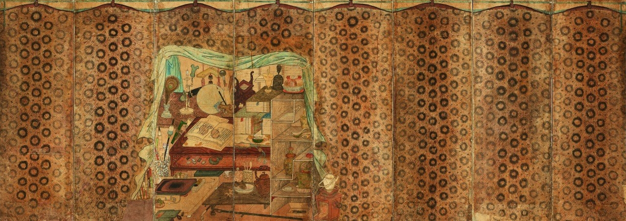
Scholar’s Studio Behind a Leopard Skin Curtain,
Korea, 19th century. Eight-panel folding screen, ink and color on paper; 128 x 335 cm


Cheakgeori Panels, Korea, screen, ink, and color on paper; 38 x 61 cm
Tracing back the brief history and origin of Chaekgeori, I have realized through the passing of time Cheakgeori has indeed acquired an individual aesthetic. The progression of achieving its uniqueness started by copying the exterior of the Kunstkammer that adopted the style of the Studiolo. Just like creating a replica from admiration of its visual beauty, without appreciating the intention or history behind it. However, creating visual art is a process of analyzing and destructing visual elements into pieces and reassembling them, and jumbling them up until the elements are all intertwined to the point it is untraceable from their roots. My recent work “Coven of Witches Diptych” is an homage to the Kunstkammer and Cheakgeori. This cabinet painting will eventually be adapted into a 3 piece, triptych. This piece is a representation of my struggle to figure out the very part of my ego that I can claim is mine.
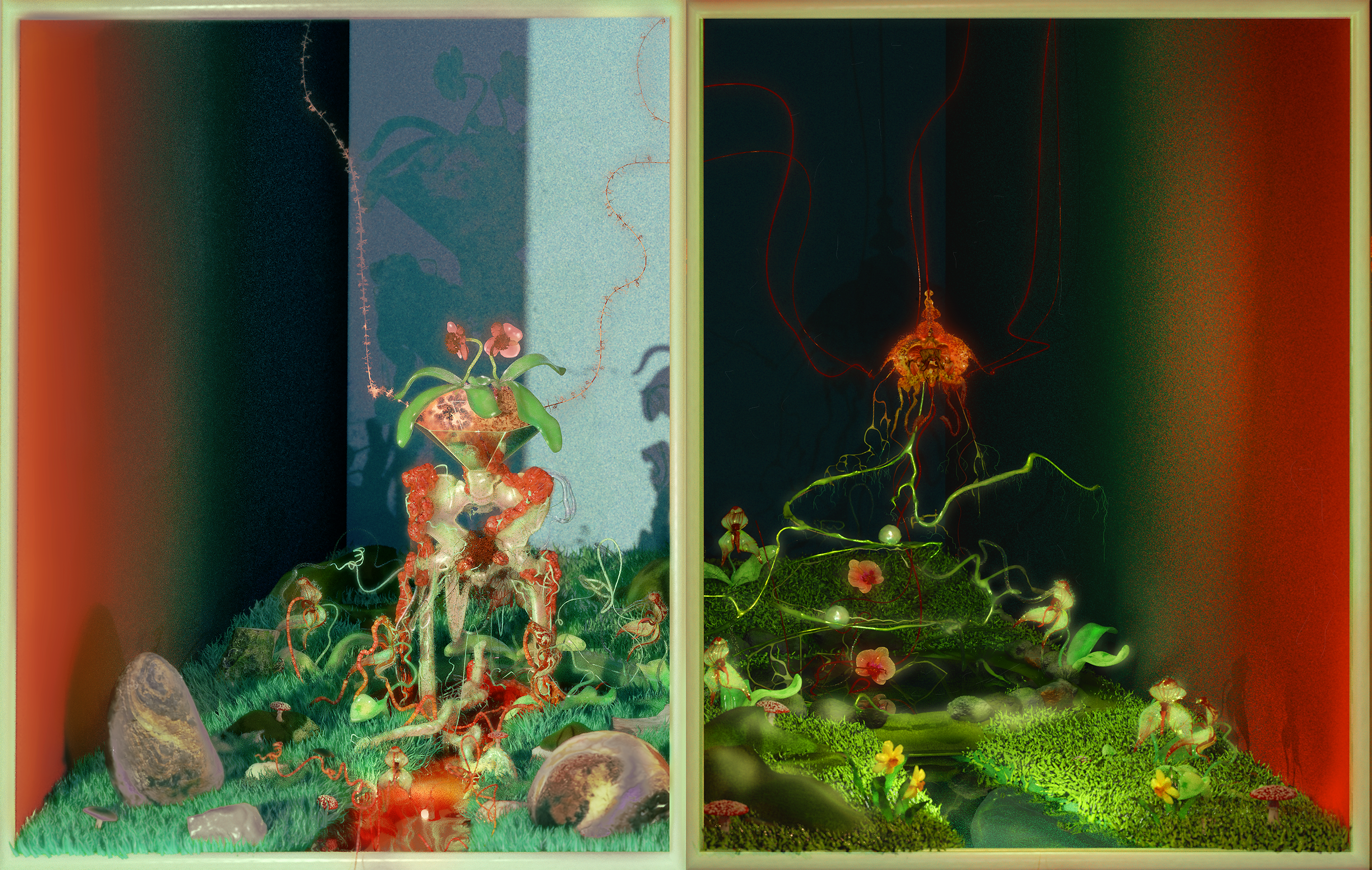
Coven of Witches Diptych (not yet resolved), digitally rendered by Blender, 144x 227 cm
The two images above are completed by the centerpiece that is in progress. As it is evident, the image has borrowed the structure of Chaekgeori. However, my adaptation of it also combines the expression used in Albrecht Dürer’s engravings and Hieronymus Bosch’s panel paintings. This will be further discussed in the unit 3 research.
3.Interpreting Giallo and succeeding its legacy
Giallo films are known for their distinctive cinematography and their fame among the cult film fandom. Yet until now, it has not come to a consensus on what aspects make Giallo a Giallo. To briefly introduce its history Giallo films got their name from the crime or murder mystery books which had bright yellow covers. These Giallo books featured exclusive Italian translations of the famous British and American mystery literature, but as time passed other publishers released cheap novels that seemed to be heavily influenced by the Sherlock series or Edgar Allen Poe. Eventually the Italian word “yellow” (Giallo) referred to a film genre that shares a similar theme, but the crime mysteries were categorized in a different genre called Poliziotteschi.
The origin behind Giallo films explains the nature of its genre quite well, since the film also seems to borrow the structure of the mystery novels but it does not quite capture the essence of the well-written classic mysteries. I have been looking through books and articles that mention the history of these films and nobody could agree on which film was the start of Giallo, so it is understandable that people could not yet critically analyze the key characteristics of them.
Yet there are several cues that are often mentioned. The first is always the stylized cinematography of these films. This usually ends up bringing up the issue of objectifying and exploiting women and being unable to escape from the criticism of misogyny. The slaughtered women are always depicted beautifully even at the moment when they are brutally murdered but the impressionistic visual perfection, in terms of color, fashion, and decoration seems to blur the cruelness of it.
The second aspect that consists of Giallo is the looseness of its structure. This is probably the core reason why Gialli is cited as an epitome of Camp. The content of those films is mostly limited, which is why it is likely to be evaluated as banal slasher film. Nonetheless, Giallo is unique in the way that its structure is poor despite the precision the directors have put in. For instance, the music of the movie can be an aural delight but at the same time, the poorly dubbed narration can be very intrusive. Another example is how the plot blurs out the reality and folklore. In Dario Argento’s film Suspiria and Phenomena the incidents are happening are captured in a realistic style, but as it becomes close to the climax they deploy daring scenes that can be found in artistic films.
My recent animation “Clean Slate” was an attempt to embrace this conflicting nature of Giallo. The lack of verisimilitude in the Giallo films is passable because the stylistic power from the jarring visual and aural effects describes the paranoia and confusion that the protagonist experienced. After all, paranoia can’t be described through a logical and rational narrative. “Clean Slate” describes the confusion, the conflicting feelings toward a long friend, and the second part involves the fear and paranoia of being replaced not only as a friend but as an artist and a human being. If I were to explain how my fear jumped from one thing to a totally unrelated subject through words it would take at least a couple of hours. But if I involve music and images this can be done quite quickly and even more convincing.